Everyone needs an image optimizer. Here's an easy way to reduce file size while maintaining image quality.
Via Tom D'Amico (@TDOttawa)
Get Started for FREE
Sign up with Facebook Sign up with X
I don't have a Facebook or a X account


 Your new post is loading...
 Your new post is loading...
Your new post is loading...
Everyone needs an image optimizer. Here's an easy way to reduce file size while maintaining image quality. Via Tom D'Amico (@TDOttawa) 
No comment yet.
Sign up to comment
From
dustn

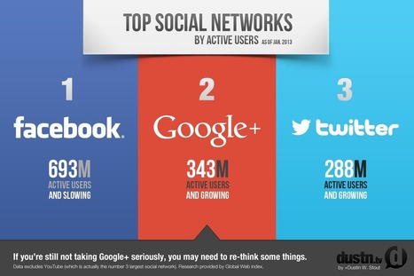
Reports now show that Google+ has surpassed Twitter in active users and is second only to Facebook. A new report by Global Web Index shows that Google+ has surpassed Twitter in active users and is second only to Facebook.
Technically YouTube was considered #3 and Twitter came in at #4 by the numbers. Although it is good to note that Twitter is actually the fastest growing of them all, with 40% growthin the last quarter. Via Lauren Moss

Two Pens's curator insight,
March 3, 2013 6:24 PM
Interesting that G+ ranks #2 with so few people actually using it as a network. Shows the power of Google that everybody feel like they have to belong to it but so many don't use it :-) Nobody wants to get left behind. 
Janet Louise Stephenson's curator insight,
May 3, 2013 10:23 PM
Do you believe that Google+ moved ahead of Twitter?

'It's about having a holistic, functional system.' To frame this series, I'd like to share with you the Two Things about web measurement. Since first thinking about this, I've revised them a few times, but I think I've settled here: I believe that if you stick to these two things as non-negotiable truths, you'll get the most out of the measurement you do...
Via Lauren Moss

Belle Chua's curator insight,
January 1, 2014 11:19 PM
Crafting your way to understand and making sense of web measurement |

Graphics, charts, diagrams and visual data representations have been published on books, newspapers and magazines since they've existed, not to mention old maps and scientific illustrations...
Despite the lack of tools such as the ones we have at our disposal nowadays, they are as inspiring and important as the best contemporary visualizations. Visit the article link for a gallery of vintage visualizations... Via Lauren Moss, Bucky Dodd

Charlley Luz's curator insight,
July 20, 2013 10:26 AM
muito legal, os Infográficos antes de existir a internet. 35 exemplos de infográficos no papel :) Achei falta do Marcha para Moscou do Minard http://www.datavis.ca/gallery/re-minard.php ; 
Leoncio Lopez-Ocon's curator insight,
July 20, 2013 2:57 PM
El brasileño Tiago Veloso, fundador de Visual Loop, nos ofrece 35 interesantísimas representaciones visuales de distintos fenómenos y eventos que permiten hacer un paseo por la historia de la ilustración científica.

Information graphics or infographics are graphic visual representations of information, data or knowledge. These graphics present complex information quickly and clearly, and are easy to understand. Infographics are sources of interesting information, when you are in need of some. Reading boring, long, colorless articles isn’t so attractive and interesting than reading and viewing facts and numbers in an illustrated way. Not only an illustrated way, but a very creative, attractive and super-appealing way. All of them have been designed not only to look good, but also to expose the maximum information and data possible. These infographics were made by some very talented designers, with creative minds and superb skills. While there are lots of really interesting and cool infographics on various topics, in this post we have only gathered awesome infographics which are of interest to web designers and developers... Via Lauren Moss
|