Your new post is loading...

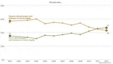

Regardless of your politics, this chart is a great example of how data can tell a story. It's a very simple graph by the Pew Forum on Religious and Public Life showing the changing attitudes about same-sex marriage. It shows that in the past couple of years, people have begun to be in favor of same-sex marriage.
I'm showing this chart because it so clearly represents the story of the data. The eye is immediately drawn to where the "oppose" and "favor" lines cross. Other obvious choices for this data would have been a stacked bar chart or a side by side bar chart as shown here (which I created with the source data just as examples)...
Via Lauren Moss