


 Your new post is loading...

![6 Best Practices of Responsive Web Design [Infographic] | Information Technology & Social Media News | Scoop.it](https://img.scoop.it/GEiP8AlElwKVA2cIR8IpFDl72eJkfbmt4t8yenImKBVvK0kTmF0xjctABnaLJIm9)

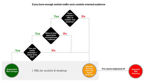
Responsive design for a website is often used in the context of mobile users.
Given the fact that more and more users are using mobile devices such as their smartphones and tablets to access the web, both for browsing and otherwise, it is extremely important that website designs become responsive towards all devices and screen sizes.
Find more advantages, benefits and best practices of responsive design at the infographic and article link.
Via Lauren Moss, Ivo Nový


![The Role of Color in Marketing [INFOGRAPHIC] | Social Media Today | Information Technology & Social Media News | Scoop.it](https://img.scoop.it/5ZsauP9vA_nIpv1lGd_Vszl72eJkfbmt4t8yenImKBVvK0kTmF0xjctABnaLJIm9)

![Responsive Website Design, What Is It? [Infographic] | Information Technology & Social Media News | Scoop.it](https://img.scoop.it/YtWxZJhmhunmTavtdcNcJzl72eJkfbmt4t8yenImKBVvK0kTmF0xjctABnaLJIm9)


Interessante infografica che mostra le dimensioni ideali degli oggetti web e delle immagini quando si progetta un template resposive.
Responsive designs are the window into the future of web portability to drive higher per user engagement by embedding the concept of Probability Scores. An aggregate of Content Scores & Engagement Scores are debated prior to finalizing which sections gets a higher Probability Score that will eventually determine content position in the responsive design layout. Probability Scores aims at achieving better per user click through rate owing to its full width auto adaptive content display interface that adjust the landing page content based on the device.
Earlier websites used to feed different URLs for different devices. For example m.sitename.com or mobile.sitename.com indicated that the URL is for mobile or smart devices. But now things have changed thanks for responsive design attributes that determines the device that is trying to access the site URL before optimizing the content layout to adjust automatically with the device interface. This way the same URL is serving any device that is trying to access the website which again is compliance for search engine algorithm.
Responsive design has the advantage to every inch of the device or browser interface to maximize the user’s engagement intent possibility. Compelling visual storytelling theme powered by catchy headlines or titles richly feed with an interesting content copy furthermore elevates user interest to engage. This nature in elevating intent & urge to get involved have statistically indicated the favourability of lead generation & conversion rates from responsive designs.
Mobile devices will overtake PC user worldwide citing encouraging statistics to enthuse responsive design for websites, emails & landing pages. Responsive design layouts devised with #ProbabilityScores are based on the overall marketing objectives & branding goals. An implosive content marketing strategy with a creative team of visual storytellers delivers inspiring results and therefore the greater goodness is in the adoption of Responsive Site Design.
#ProbabilityScores <> #ContentScores <> #ContentEngagement
Visit the blogs4bytes Responsive Content Design HomepageCheck out the Responsive Content Scores for the blogs4bytes Homepagehttp://sonicrituals.brinkster.net/ps/probabilityscores.png
Responsive Design, Parallax Campaigns, Hashtag Marketing, SEO & SMO all blend into one to serve a hot cup of result driven digital marketing performance with #blogs4bytes // Follow the conversation.