


 Your new post is loading...


Excerpted from article:
"If you don’t have a good landing page, it’s like going fishing without a net: you might land a big one on your hook, but you won’t be able to drag it into the boat.
You don’t want people to just visit your page. You want them to take action once they are there. So make it as easy and compelling as possible for them by including these elements found in a landing page that CONVERTS:
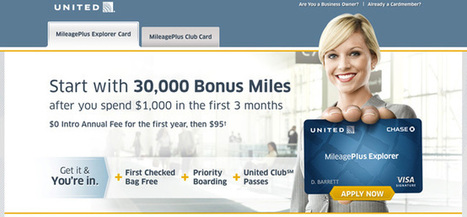
C = Clear Call to Action
O = Offer
N = Narrow Focus
V = VIA: Very Important Attributes
E = Effective Headline
R = Resolution-Savvy Layout
T = Tidy Visuals
S = Social Proof
CLEAR CALL TO ACTION:
Whatever it is you’ve decided will move people further along your conversion funnel. That’s what you should be asking them, clearly and temptingly, to do. Don’t distract them with lots of other requests. The best pages accentuate only one CTA.
OFFER:
An offer is anything you give your visitors in exchange for getting them to do what you want. This can mean offers in the traditional sense of coupons or discounts, but it also can mean a free trial, a free version of the product, a whitepaper, or a matching gift.
NARROW FOCUS:
Research has shown that the more choices you offer people, the longer they take to make a decision. So the clearer and simpler you make your page, the more likely you are to get someone to take the action you want.
- Do you really need that navigation bar?
- Do you really need to talk about your company philosophy?
- Do you really need to collect all that information?
VIA: VERY IMPORTANT ATTRIBUTES:
We’ve all heard stories of companies that reserved a catchy URL, put up zero information about what the site was for, and harvested 1 million email addresses before they even launched.
You should assume that’s not going to happen to your company.
Instead, you’re going to have to give visitors some good reasons they should do what you want. Those reasons are the VIA: Very Important Attributes.
EFFECTIVE HEADLINE:
People coming to your site are going to decide in a split second if they want to go back to their game of “Words with Friends” or stay and see what you are all about. A key way to keep them is to tell them in plain language what your site is all about.
RESOLUTION-SAVVY LAYOUT:
Do you know that there are people out there still surfing the web on 800 x 600 monitors?
Keep the most essential parts of your message – logo, headline, call to action, a supporting visual – in the center top of the screen, with supporting messaging lower down on the page.
TIDY VISUALS:
As with the headline, distracting elements can work when you’re trying to get attention. But when people are on your site, you don’t want to sidetrack them with a bunch of visual junk.
SOCIAL PROOF:
As social creatures, humans tend to place greater value on things that other people have already approved. That is why most sites will tend to display evidence of such social validation."
In the original article there are more information about: "Considerations for strategy", "Considerations for design", "The cautionary tale", "Doing it right" and some examples. Check out full interesting article here:
http://blog.kissmetrics.com/c-o-n-v-e-r-t-s/
Via Giuseppe Mauriello, Robin Good


Great Acronym for making people convert to sales (or leads) on your site. Keep it simple Stupid ! KISS is always another
Useful tips that bear repeating often even though they should be well known to all marketers.
The "call to action" can make a big difference in a successful marketing effort.