Nouveaux paradigmes
160.2K views | +0 today
Follow
Nouveaux paradigmes
Converger vers les sujets qui nous font réfléchir autrement... parce que notre richesse est ailleurs !
Your new post is loading...

Current selected tag: 'dataViz'. Clear
Rescooped by Christophe CESETTI from Le BONHEUR comme indice d'épanouissement social et économique.
Scoop.it!

40 more maps that EXPLAIN the world

40 more maps that EXPLAIN the world | Nouveaux paradigmes | Scoop.it
I've searched wide and far for maps that can reveal and surprise and inform in ways that the daily headlines might not.


Maps seemed to be everywhere in 2013, a trend I like to think we encouraged along with August's 40 maps that explain the world. Maps can be a remarkably powerful tool for understanding the world and how it works, but they show only what you ask them to. You might consider this, then, a collection of maps meant to inspire your inner map nerd. I've searched far and wide for maps that can reveal and surprise and inform in ways that the daily headlines might not, with a careful eye for sourcing and detail. I've included a link for more information on just about every one. Enjoy.


Via Sigalon, Sémio PUB, association concert urbain
Christophe CESETTI's insight:

• Pearltree "Géographie"
Réponse de Gérard Foucher à la carte Where the world's 30 million slaves live ?

Terheck's curator insight, January 26, 2014 5:58 AM

Une sélection de 40 cartes qui permettent de mieux comprendre notre monde.

Jessica Rieman's curator insight, February 11, 2014 2:30 PM

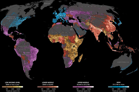
When looking at this map there area few things that stick out to me and not just the colors. Fistly what I founf interesting was that South America in relation to where we live is quite different. For example, The US economic status is High Class at $12195 or more for most of the East and West Coast and then it is dull in the middle. These facts compared to South America where they are mostly upper middle class at around $3946-12185 and a portion of them are the lower middle class which rings in at around $886-3945.

Jake Red Dorman's curator insight, November 13, 2014 2:39 PM

 On map 33, it shows the religious borders map of the different religions that are occupying certain areas of the Middle East. The area of Baghdad and east is mostly Shiite Islam and west of Baghdad is Sunni Islam. What I found to be most interesting is that even though Jerusalem is surrounded by many different religions they still celebrate Judaism. They are religiously protected by its borders. There is some sign of Sunni Islam being practices within their borders but it is mostly dominated by Judaism. 

Scooped by Christophe CESETTI
Scoop.it!

En bleu les riches, en rouge les pauvres... Faites le test dans votre quartier - Rue89

En bleu les riches, en rouge les pauvres... Faites le test dans votre quartier - Rue89 | Nouveaux paradigmes | Scoop.it

L’association Regards Citoyens attire notre attention sur une visualisation plutôt bien ficelée : les revenus des Français par carrés de 200m de côté...


La carte se base sur les données de l’Insee, qui publie les revenus « carroyés » des ménages au 31 décembre 2010. Il s’agit des revenus fiscaux, c’est-à-dire de ceux déclarés par les contribuables avant tout abattement ou redistribution. D’autres données sont également disponibles : âge et densité de population.


La carte en direct http://www.comeetie.fr/galerie/francepixels/#

Christophe CESETTI's insight:

Beau travail de dataViz !

En même temps il s'agit de savoir de quoi nous sommes riche ou pauvre ? joie de vivre, bonheur, monnaie, intelligence, culture, gentillesse, empathie, capacité de se relier aux autres ... ?

No comment yet.
Scooped by Christophe CESETTI
Scoop.it!

All the parities in China: Which countries match the GDP, population and exports of Chinese provinces?

All the parities in China: Which countries match the GDP, population and exports of Chinese provinces? | Nouveaux paradigmes | Scoop.it

China is now the world's second-biggest economy, but some of its provinces by themselves would rank fairly high in the global league. Our map shows the nearest equivalent country. For example, Guangdong's GDP (at market exchange rates) is almost as big as Indonesia's; the output of both Jiangsu and Shandong exceeds Switzerland's. Some provinces may exaggerate their output: the sum of their reported GDPs is 10% higher than the national total. But over time the latter has consistently been revised up, suggesting that any overstatement is modest.


What about other economic yardsticks? Guangdong exports as much as South Korea, Jiangsu as much as Taiwan. Shanghai's GDP per person is as high as Saudi Arabia's (at purchasing-power parity), though still well below that in China's special administrative regions, Hong Kong and Macau. At the other extreme, the poorest province, Guizhou, has an income per head close to that of India. Note that these figures use the same PPP conversion rate for the whole of China, but prices are likely to be lower in poorer provinces than in richer ones, slightly reducing regional inequality.


Source : http://www.slate.fr/lien/34823/chine-comparaison

No comment yet.
Scooped by Christophe CESETTI
Scoop.it!

Data Farming: Demonstrating the Benefits of Urban Agriculture [INFOGRAPHIC] | Sustainable Cities Collective

Data Farming: Demonstrating the Benefits of Urban Agriculture [INFOGRAPHIC] | Sustainable Cities Collective | Nouveaux paradigmes | Scoop.it
Design Trust put together a metrics framework that measured the associated activities of urban agriculture with the known benefits derived from various studies to convince city officials of urban farming's positive impacts.
No comment yet.
Scooped by Christophe CESETTI
Scoop.it!

It’s All Connected: An Overview of the Euro Crisis

It’s All Connected: An Overview of the Euro Crisis | Nouveaux paradigmes | Scoop.it

The global financial system is highly interconnected. So problems in one part of the world can reverberate almost everywhere else — risking a cascade of default, contagion, contracting credit and collapsing economic activity. Exhibit A now is Europe.

No comment yet.
Rescooped by Christophe CESETTI from Propagation Organique, Viralité - Spreading Phenomenons
Scoop.it!

Spread of information after Fukushima earthquake

This video displays worldwide retweets of Tweets originating in Japan for one hour after the earthquake. Senders’ original Tweets are shown in red; Tweets retweeted by their followers in the hour after the event are displayed in green.

Via Marc Tirel
No comment yet.
Scooped by Christophe CESETTI
Scoop.it!

Pisa 2012 results: which country does best at reading, maths and science?

Pisa 2012 results: which country does best at reading, maths and science? | Nouveaux paradigmes | Scoop.it
How do countries compare for reading, maths and science performance? The latest Pisa results from the OECD show which countries are making the biggest improvements and which could do better
No comment yet.
Scooped by Christophe CESETTI
Scoop.it!

DataParis.io - Une dataviz interactive sur Paris et les Parisiens

DataParis.io - Une dataviz interactive sur Paris et les Parisiens | Nouveaux paradigmes | Scoop.it
DataParis est une data visualisation qui met en avant des données sur Paris et les Parisiens localisées par le biais du réseau métropolitain.
No comment yet.
Scooped by Christophe CESETTI
Scoop.it!

Chômage & pénurie de Talents : qui est coupable ?

Chômage & pénurie de Talents : qui est coupable ? | Nouveaux paradigmes | Scoop.it
Le chômage est devenu normal dans les pays industrialisés. Dans le même temps, les employeurs ont de plus en plus de mal à trouver les compétences dont ils ont besoin. Comment l'expliquer ?
No comment yet.
Rescooped by Christophe CESETTI from Journalisme graphique
Scoop.it!

A Campaign Map, Morphed By Money

A Campaign Map, Morphed By Money | Nouveaux paradigmes | Scoop.it

We've reshaped the United States based on where superPACs and other outside groups spent their money to air political ads aimed at influencing the presidential election.  The result?  One weirdly telling map.


Via Jack Loring, Karen Bastien
No comment yet.
Scooped by Christophe CESETTI
Scoop.it!

Infographie : Usages des Réseaux Sociaux d’Entreprise | Entropic Synergies

Infographie : Usages des Réseaux Sociaux d’Entreprise | Entropic Synergies | Nouveaux paradigmes | Scoop.it

Infographie réalisée par Yoolink traitant des usages des réseaux sociaux par ceux qui les déploient.

No comment yet.
Scooped by Christophe CESETTI
Scoop.it!

The Information Sage

The Information Sage | Nouveaux paradigmes | Scoop.it
Meet Edward Tufte, the graphics guru to the power elite who is revolutionizing how we see data.
No comment yet.