


 Your new post is loading...

From
mediakar
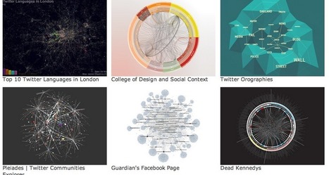
Every designer knows the problem: where to look for inspiration and new forms of visualization? As available data and visualization tools evolve, this question is becoming increasingly relevant for data journalists as well. Shall we choose a bar chart or a map? What are the best practices out there? Who has done what already? These five data visualization catalogs feature and categorize the best projects out there...


If you're a blogger, journalist, dataa journalist or designer, this is a fabulous resource and creative reference.