 Your new post is loading...

|
Scooped by
Marteq
|
Some of the benefits of a microsite include:
1. It allows more pages to be indexed by Google
2. You can craft a controlled experience on each page (vs. a section where people can move up and down to other sections)
3. You can add a lot more content to a certain page, without making your landing page a giant.
4. You can get more advanced with your analytics research as there are many different click-pathways within a microsite that aren’t possible to track or design for on a single page.
5. The technique I’m going to show you takes an Unbounce landing page, turns it into a 5-page microsite.
First, Choose a Landing Page to Work With. The five-step process is then as follows:
1. Create the microsite pages, by duplicate your landing page 5 times
2. Delete the page sections you don’t want on each microsite page
3. Create a Sticky Bar and add five navigation buttons
4. Set the URL targeting of the Sticky Bar to appear on the microsite pages
5. Add the Unbounce global script to your site
6. Click “Publish” << hardly a step.
|
|
Scooped by
Marteq
|
1. Single Option Aversion
You’ve probably heard of “the paradox of choice”, the theory that if you are presented with too many options, you are less likely to make a decision. Well, it turns out that most experiments attempting to replicate that effect don’t actually find it. The effect may be real, but it seems to only occur in idiosyncratic circumstances that nobody yet fully understands. So while it’s certainly important for landing page design to be simple and clear, it’s almost certainly a bad idea to give your consumers too few options, especially only one.
2. Opportunity Cost
When the clock was ticking, the participants used “lexicographic choice,” i.e. they compared options by their most important attributes first, then by the second most important attributes, and so on. What does this mean for landing pages? You need to determine what your most important differentiators are, how consumers are comparing products, and make sure that those differentiators stick out as soon as users hit your landing page.
3. Hyperbolic Discounting
This is an effect that has been replicated in a wide variety of experimental designs. Put simply, we humans have a bias for the present. A dollar today is worth more than two dollars next month. According to research by George Ainslie, people prefer “smaller sooner” rewards over “larger later” rewards. We will take $50 today over $100 in six months, even though we won’t take $50 in three months over $100 in nine months, even though this is just the same choice viewed from a distance of three months.
|
|
Scooped by
Marteq
|
Product landing pages are built to generate conversions
Landing pages –– i.e. your product pages –– are specifically created to increase conversions. It’s why they’re so important to get right.
A conversion is any defined action that you’d like your page visitors to take:
signing up for your emails or deals
subscribing to your blog
downloading an e-book
following your store on Instagram
And, of course, that conversion can be a sale.
|
|
Scooped by
Marteq
|
|
|
Scooped by
Marteq
|
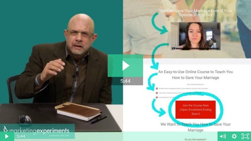
In this Quick Win Clinic, Flint McGlaughlin optimizes a webpage that provides marriage counseling. The CTA is in a prominent position but fails to achieve
|
|
Scooped by
Marteq
|
By setting the expectation of a gated offer early on -- by using a form that looks and reads just like our normal landing pages, but opens into an HTML page upon form submission instead of an offer download -- more people will fill out the form.
We pitched the idea of a brand new, gated template that looks and reads just like our regular landing pages, with one key difference: When the user clicks the form submission button, the page opens into an HTML page, instead of leading to a thank-you page with a PDF download button.
Using the new un-gated template, the two offers we tested both achieved significant increases in net organic submissions and contacts, compared with the original landing pages.
1) We're not tricking the search engine or the user.
2) Mobile favors hidden content, so Google has been relaxing its policies.
|
|
Scooped by
Marteq
|
1) In the Travel Industry, Keep Language Positive
2) Don't Disgust in Business Consulting
3) Fear mongering doesn't lead to more conversions (most of the time)
4) Shoot for Short and Sweet Business Services Pages
5) Spread the Joy of Higher Education
6) Trust Words Work in Some Industries ... But Not Others
7) Keep Copy Concise in Credit & Lending
8) Avoid buzzwords in Business Consulting
9) Joy Isn't Always a Conversion Booster
|
|
Scooped by
Marteq
|
"1. Obsess over your title tag and meta tag description.
2. Make the content on your pages match searchers’ needs.
3. Make sure your landing page is mobile-optimized.
4. Make sure your landing page loads quickly.
5. Make sure your landing page is marked up well for SEO.
6. Consider adding a video or a simple interactive assessment tool.
7. Add a comparison table."
|
|
Scooped by
Marteq
|
"Tip #1: Replace with Dynamic Text
Tip #2: Use Target Personas
Tip #3: Consider User’s Intent
Tip #4: Keep Copy Localized
Tip #5: Match Scent & Design
Tip #6: Match the Copy
Tip #7: Match the Keywords
Tip #8: Match the CTA
Tip #9: Match Number of Variations
Tip #10: Keep It Simple
Tip #11: Match with Email
Tip #12: Declare the Benefits"
|
|
Scooped by
Marteq
|
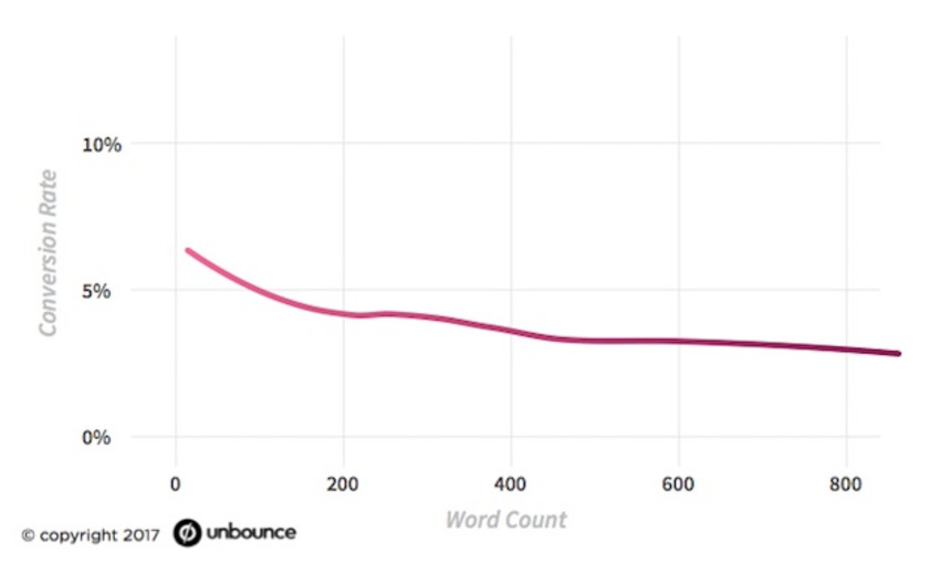
Landing pages that are short and use simple language have much higher conversion rates, this study finds. The median rate varies from 2.8% to 5.5%, depending on the industry. See more results!
|
|
Scooped by
Marteq
|
A good offer alone is not enough to guarantee success. You also need to push that offer to your target audience. Typically in the form of a landing page.
|
|
Scooped by
Marteq
|
Inspire more clicks, sales & signups with your overlays
Download our free Spring Overlay Lookbook, featuring 8 oh-so-beautiful, Unbounce-built overlays.
|
|
Scooped by
Marteq
|
Consider the following tips for producing high-quality video landing pages:
- Start now.
- Don’t let cost sway you. Video content is much cheaper to produce than most marketers realize.
- Know your audience. Well-researched customer profiles are one of the most powerful tools in a marketer’s arsenal.
- Consider how the video is optimized.
- Make it relevant and valuable.
|
|
Scooped by
Marteq
|
"Conversion Rate Optimization
1) Picreel
2) Lucky Orange
Form Builders
1) 123Contact Form
2) Google Forms
3) Wufoo
4) JotForm
5) Best Contact Form
6) Typeform
Landing Page Builders
1) LeadPages
2) Unbounce
3) Instapage
4) Thrive Landing Pages + Thrive Content Builder"
|
|
Scooped by
Marteq
|
1. Why are you launching an overlay?
2. Where will you place your overlay?
3. Who should see your overlay?
4. What is your overlay offer?
5. When should your visitors see your overlay?
|
|
Scooped by
Marteq
|
|
|
Scooped by
Marteq
|
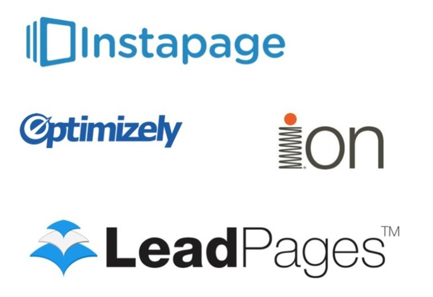
Key things to consider before purchasing and using these tools:
- Ease of use of setting up tests
- Integration with CRM systems you use or plan to use
- Quality of templates which can be amended - layout, field-level data collection options and style needs to be suitable for scale of business and sector. Today most are mobile-responsive.
- Account management for use by multiple users in agencies and larger organisations
Below are five tools we recommend for creating and testing landing pages.
Unbounce
LeadPages
Instapage
Ion Interactive
Optimizely
|
|
Scooped by
Marteq
|
In it, Martin uses the fMRT process, which is short for functional magnetic resonance imaging to “get a glimpse into the head of consumers.”
Here’s what he found:
- “Our brains usually run on autopilot, despite making us believe we know what we are doing.”
- “90 percent of all purchasing decisions are not made consciously.”
- “Most purchasing decisions take as little as 2.5 seconds.”
- “Brodmann Area 10 in the human brain’s frontal cortex is activated if someone ‘thinks a product is really cool’. This area is linked to self-awareness and emotions.”
- “Brands and products that evoke our emotions, like Apple, Coca-Cola or Nivea, always win.”
|
|
Scooped by
Marteq
|
1. Streamline Your Design
2. Make Content Easy to Read
3. Pick the Right Palette
4. Choose Fonts Wisely
5. Play With Symmetry
6. Don’t Forget About Quality Imagery
7. Optimize Your CTA Button: When there is a specific action you want a visitor to take, you have to make it easy for them to take that action. Your CTA button needs to be foolproof. There are a few tweaks you can make to create a CTA button that converts.
|
|
Scooped by
Marteq
|
PPC Landing Page Tip #1: Combat Bots with Honeypots
“The simplest way to implement a honeypot is to add a hidden ‘test_email’ field in addition to your ‘email’ field to your form. This will trick the bot into completing both fields, and your human prospects won’t know it ever existed.” Once the leads roll in, simply filter out any in which the text_email field were completed, exclude those IP addresses (more on that in a minute), and focus on the real leads.
PPC Landing Page Tip #2: Reconsider Your Customer Reviews
If you really want to include customer reviews on your website, do so in a place where you aren’t sending paid traffic. Develop a separate testimonial page and test it as a sitelink extension if you think it would have value. Even if every customer who has interacted with your business has had a positive experience, if you’re going to leverage the power of social proof on your landing pages, curate it first.
PPC Landing Page Tip #3: Make Sure Your Landing Pages Load Like a Slayer Riff
Improving landing page load times isn’t a one-and-done proposition. Instead, it often takes a handful of subtle changes. To get an idea of where you’re at, throw the URL for one of your landing pages into the PageSpeed Insights tool.
|
|
Scooped by
Marteq
|
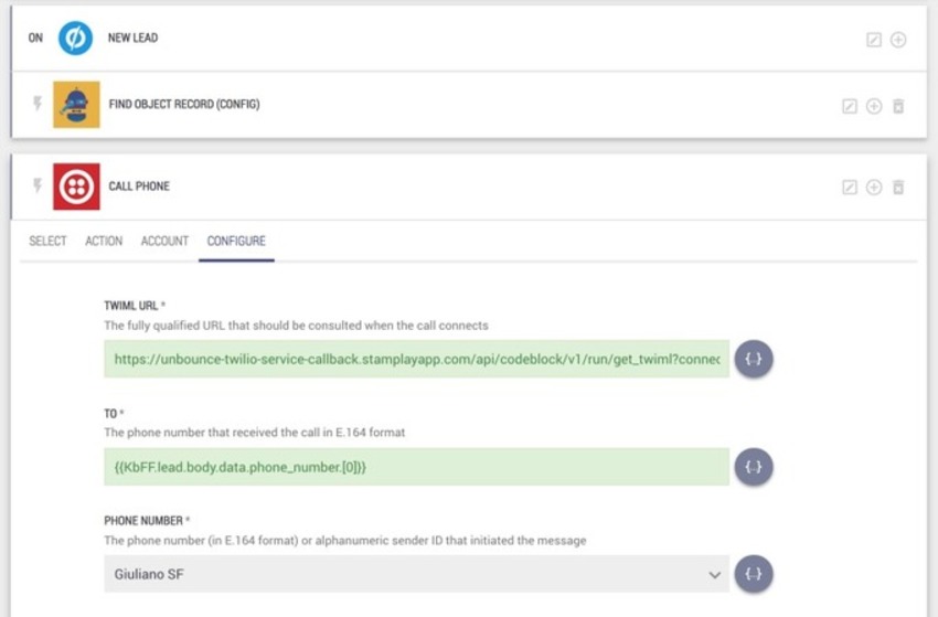
"Building a click-to-call or call back landing page takes minimum effort and this example shows you how to build one using Unbounce and Twilio.
The call-back landing page works by inviting a user to leave their phone number to receive a call from a company representative.
While it shouldn’t be the only way to get in touch with the company, a call-back landing page gives users a quick way to hear back from a company without going through the phone connection options."
|
|
Scooped by
Marteq
|
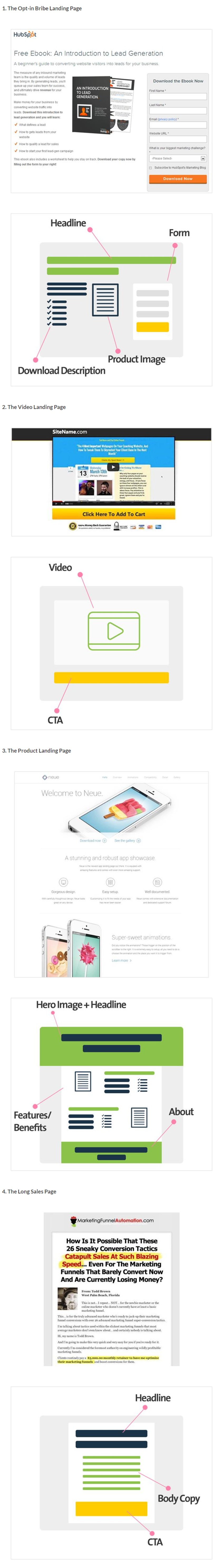
This Ebook highlights all the important elements that come together to create a high performing landing page along with taking a leaf out of the 2016 landing page design trends. Pro-Tips and Landing Page best practices can prove helpful in planning for your 2017 landing pages more efficiently.
THE EBOOK COVERS
- Importance of a Landing Page
- Details on basic elements that make up a Landing Page
- Pro tips to take heed while including the elements
- Notable design trends observed in 2016
|
|
Scooped by
Marteq
|
7. Collect newsletter subscribers
8. Offer an ebook, case study or course
13. Offer a resource that qualifies prospects
14. Cross-sell
15. Re-engage with more content
|
|
Scooped by
Marteq
|
Whether a timeless goodie or a shallow one-hit-wonder, trends are popular for a reason. Here are 34 landing page trends worth testing out yourself.
|
|
Scooped by
Marteq
|
Five Secret Sauce Strategies for Reducing Landing Page Anxiety: - Placement: Place one or two of your best testimonials as close as possible to your form
- Message Alignment: The landing page message needs to echo the message in the email or online ad that brought your visitor to the page.
- Appear to be What Your Target Audience Expects: You need to show your prospects that you are one of them. You speak their language and understand their needs.
- Design clarity
- Offer Clarity
|
|


![How to Turn Product Pages into High Converting LPs [14 Examples] - Big Commerce | The MarTech Digest | Scoop.it](https://img.scoop.it/1DSiWPOdOuXPj9wV807BkfL6dadsvGA8m9WNoVsbzkY=)
![Copywriting for Conversions: 9 Ways Emotion and Word Count Affect Your Landing Pages [New Data] - HubSpot | The MarTech Digest | Scoop.it](https://img.scoop.it/HBU8d_fzR1YXE7gy265LJaWwCjYPSNRaTxwW-1h4YRQ=)


![8 Overlay Examples to Inspire More Clicks, Sales & Signups [FREE LOOKBOOK] - Unbounce | The MarTech Digest | Scoop.it](https://img.scoop.it/B_48ms4wqoVcwkul-y8-P_L6dadsvGA8m9WNoVsbzkY=)


![[FREE] Landing Page Design Elements and Trends - EMailMonks | The MarTech Digest | Scoop.it](https://img.scoop.it/Xf7hxC1a3dIzvSny5-iZjPL6dadsvGA8m9WNoVsbzkY=)


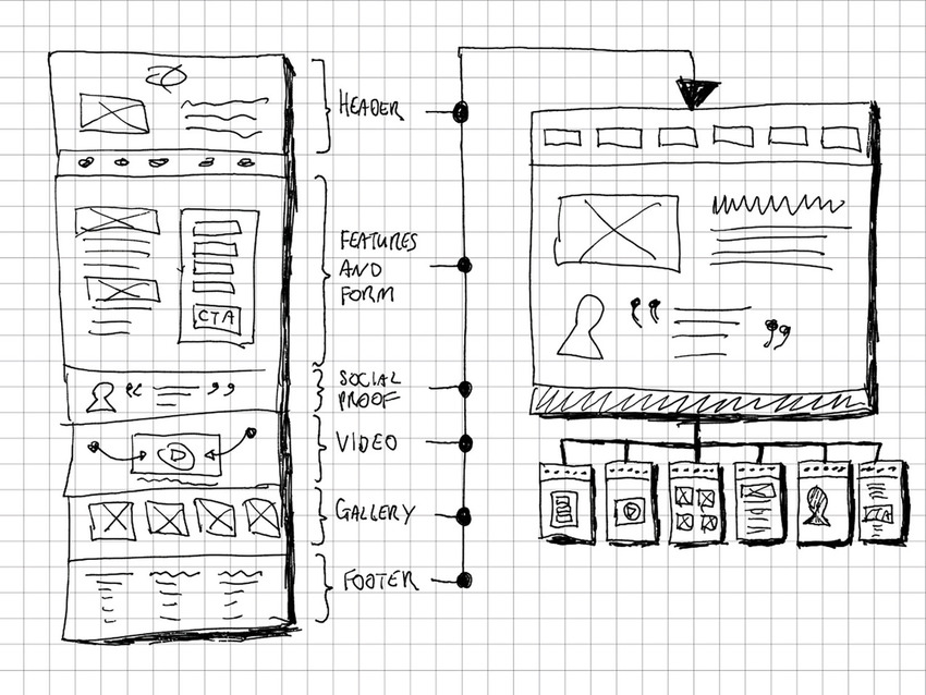
How to Turn a Long Landing Page Into a Microsite - In 5 Easy Steps - Unbounce
And if you can create personalized URLs, you can create personalized websites.
This news comes to you compliments of marketingIO.com. #MarTech #DigitalMarketing