


Research and publish the best content.
Get Started for FREE
Sign up with Facebook Sign up with X
I don't have a Facebook or a X account
Already have an account: Login

#eHealthPromotion, #SaluteSocial
117.8K views |
+0 today
E-Health promotion. #web2salute. Health 2.0
Curated by
Giuseppe Fattori
 Your new post is loading...
 Your new post is loading...
Your new post is loading...
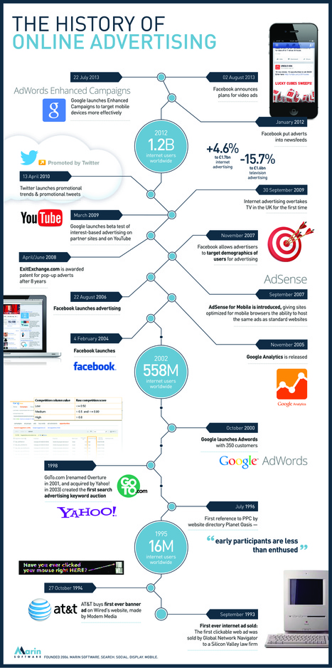
Advertising has come a long way since the first ever online ad was sold in 1993. This new infographic from Marin Software plots the industry's biggest moments, from the launch of Facebook to Twitter's promotional tweets and the more recent introduction of Google Adwords. Via Lauren Moss 

9Dotstrategies's curator insight,
October 3, 2013 4:24 AM
History of Online Advertising: An Infographic 
Lee Werrell's curator insight,
October 6, 2013 6:47 AM
Just shows the phenomenal growth of online activity - and it is set to grow exponentially as more peoiple access the internet.
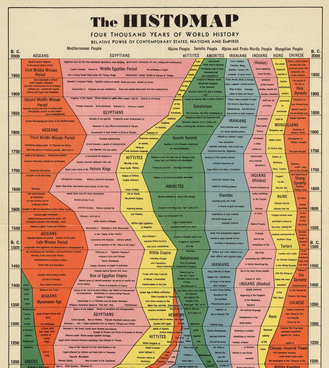
If time is a river, the Histomap, first published by Rand McNally back in 1931, is a raging Mississippi. In that massive river of time, each of humanity’s great civilizations becomes a confluence that ebbs, wanes, and sometimes ebbs again, each a separate current in a river that inexorably rages down to the mouth of the present day. Although certainly not modern, the Histomap is still a breathtaking example of good infographic design: A five-foot, roll-up chart that can fit an overview of human history on any wall. Starting in 2000 B.C. with seven different civilizations--the Aegeans, the Egyptians, the Hittites, the Amorites, the Iranians, the Indians, the Huns, and the Chinese--you travel forward or backward in time as your eyes move up or down 0.75 inches. Some civilizations bleed together, others are swallowed up; some surge, others crash... Via Lauren Moss
|
Often, complex stories are more easily communicated, understood and, ultimately, remembered, when they take visual form. Aside from data and words, infographics use images and graphical representations. Those key elements – images, words and numbers – operate as a system for simplifying information, revealing new patterns, and producing new knowledge in various fields. In fact, they might not have always been called “infographics,” but info/data-based visualizations have always been around. Via Lauren Moss
The stories behind the octothorpe, the pilcrow, the ampersand, the manicule, and the diple.

luiy's curator insight,
September 9, 2013 10:17 AM
The story of the hashtag begins sometime around the fourteenth century, with the introduction of the Latin abbreviation “lb,” for the Roman term libra pondo, or “pound weight.” Like many standard abbreviations of that period, “lb” was written with the addition of a horizontal bar, known as a tittle, or tilde (an example is shown above, right, in Johann Conrad Barchusen’s “Pyrosophia,” from 1698). And though printers commonly cast this barred abbreviation as a single character, it was the rushed pens of scribes that eventually produced the symbol’s modern form: hurriedly dashed off again and again, the barred “lb” mutated into the abstract #. The symbol shown here on the left, a barred “lb” rendered in Isaac Newton’s elegant scrawl, is a missing link, a now-extinct ancestor of the # that bridges the gap between the symbol’s Latin origins and its familiar modern form. Though it is now referred to by a number of different names—“hash mark,” “number sign,” and even “octothorpe,” a jokey appellation coined by engineers working on the Touch-Tone telephone keypad—the phrase “pound sign” can be traced to the symbol’s ancient origins. For just as “lb” came from libra, so the word “pound” is descended from pondo, making the # a descendent of the Roman term libra pondo in both name and appearance. |


An Incredible unknown story!!!
Storia incredibile!